Ontwerp een brochure voor een Vintage Lifestyle winkel
Wedstrijd gegevens:
- Wedstrijd van: vintagefurniture
- Categorie: Flyer, (Toegangs)Kaart
- Totaal budget: € 150.00
- Datum start : 19-06-2014 22:55
- Datum einde : 02-07-2014 22:48
- Status : Beëindigd
- Benodigde formaten: jpg,ai,pdf
- Relevante bestanden: Geen
-
Beschikbare talen:


- Aantal inzendingen: 20
-
Respons opdrachtgever:
laag hoog
Behoefte:
Inhoud: teksten ondersteund door foto's van winkelpui, interieur en activiteiten
Achtergrond informatie:
Soort winkel: Cadeau-, woon- en krijtverfwinkel
Overige activiteiten: meubel atelier voor het 'pimpen' van oude meubels en geven van workshops
Enkele bekende merken die we voeren: PiP Studio servies, bad- en bedlinnen en kleding, Annie Sloan krijtverf, fairtrade merken
Sfeer: Vintage uitstraling, kleurrijk, nieuw en tweedehands
Ligging: de winkel ligt in het centrum van Leiden maar niet in de bekende winkelstraten maar net daarbuiten. Parkeren voor de deur is mogelijk.
Bedrijfsomschrijving:
Woon/cadeauwinkel met vintage meubels, fairtrade interieur accessoires, Annie Sloan krijtverf, atelier en workshopruimte.
Doelgroep:
Vrouwen tussen 25 - 65 jaar met interesse in interieur
Kleuren, favoriete logo's, must haves
We hebben al een eigen logo.
De Annie Sloan krijtverf (op dit moment een hype) en het PiP Studio merk zijn onze belangrijkste producten. De uitstraling van deze producten moet terugkomen in de folder.
Annie Sloan krijtverf: iedereen kan zijn meubels pimpen met deze krijtverf zonder te schuren of te gronden. Oude, lelijke houten meubels die passé zijn krijgen een hele nieuwe uistraling.
PiP Studio (nederlands merk) met heldere en opvallende kleuren en motieven zijn al een aantal jaar een trend in Nederland en ook steeds meer daarbuiten.
De etalage heeft een foto-muur (zie derde bestand) ter herkenning.
We laten het drukken bij DRUKZO. Deze online drukker heeft een aparte pagina voor de designers waar info staat over de aanleverspecificaties: http://pocdn.net/_common/products/folders/templates/Folders_A4_naar_A5.pdf
WalidGraphix
-
-
Geen commentaar
-
Deze wedstrijd is gesloten. Commentaar geven is niet meer mogelijk.
-
-
-
WalidGraphix zegt
The back side.
-
Deze wedstrijd is gesloten. Commentaar geven is niet meer mogelijk.
-
-
-
Toelichting van de designer WalidGraphix:
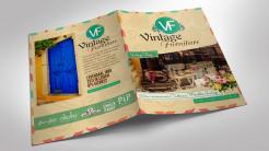
This is a preview of the brochure after printing.
-
vintagefurniture zegt :
Hi Walid,
It looks quite different but I like it. How about the texts. I can send them to you and then you can copy them exactly as they are in the brochure? -
WalidGraphix zegt
Yes, you send me the text you want, and I'll copy it instead of the random text.
-
Deze wedstrijd is gesloten. Commentaar geven is niet meer mogelijk.
-
-
-
Geen commentaar
-
Deze wedstrijd is gesloten. Commentaar geven is niet meer mogelijk.
-
-
-
Geen commentaar
-
Deze wedstrijd is gesloten. Commentaar geven is niet meer mogelijk.
-
-
-
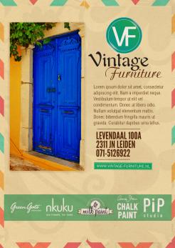
Toelichting van de designer WalidGraphix:
Hi! Changing about color is done.
-
vintagefurniture zegt :
The front page is not what I had in mind. It is too busy with the flowers en the big brown upper part. Flowers can be used but then it should be the PiP Studio flower type (the brand we carry).
-
WalidGraphix zegt
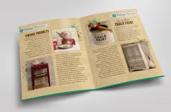
The flowers are just decorative, and don't refer to any brand. I had as a plan to show the shop in the front page, to talk about vintage products in the 2nd page, about chalk paint in the 3rd page, and finally about all the brands you carry, your adresse and your telephone number in the last page. What do you think ?
-
Deze wedstrijd is gesloten. Commentaar geven is niet meer mogelijk.
-
-
-
Toelichting van de designer WalidGraphix:
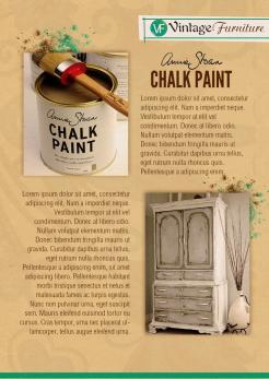
3rd side.
-
vintagefurniture zegt :
Thank you Walid
-
vintagefurniture zegt :
I like the design. Only the color is too browny. I prefer a much lighter appearance
Is that possible?
-
Deze wedstrijd is gesloten. Commentaar geven is niet meer mogelijk.
-
-
-
Toelichting van de designer WalidGraphix:
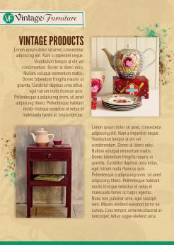
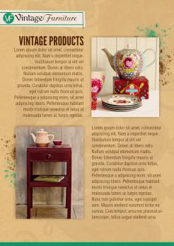
A proposition for the 2nd side.
I chosen this wood yellow (like for the 1st side) because it symbolizes the Vintage Style, and reminds wood (that's used at houses and workshops). I set also some paint splatters behind the photo because they make you think about painting at workshops ...
The texts are random, you can ask me to change them by anything you want. -
WalidGraphix zegt
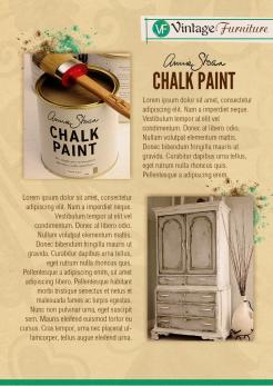
I chosen to show in the 2nd side the general Vintage products, and the Chalk Paint in the 3rd side.
-
Deze wedstrijd is gesloten. Commentaar geven is niet meer mogelijk.
-
-
-
Toelichting van de designer WalidGraphix:
A new version of the 1st side with a slight black ornament in the background.
-
Deze wedstrijd is gesloten. Commentaar geven is niet meer mogelijk.
-
-
-
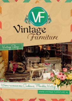
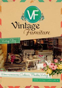
Toelichting van de designer WalidGraphix:
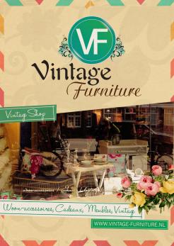
Hi! Here's my proposition for the 1st side.
As you see, I used colors, fonts, forms and textures that refer to the vintage style, and especially to have a feminine feeling. I tried to show the products of the shop through the window. The texts are random, you can ask for any changement.
Best regards, Walid. -
Deze wedstrijd is gesloten. Commentaar geven is niet meer mogelijk.
-