Cuckoo Sandbox
Wedstrijd gegevens:
Pakket goud
- Wedstrijd van: jbremer
- Categorie: Illustratie, Tekening, Kledingopdruk
- Totaal budget: € 279.00
- Datum start : 30-05-2015 10:33
- Datum einde : 27-06-2015 10:30
- Status : Beëindigd
- Benodigde formaten: jpg,ai,pdf
- Relevante bestanden: Geen
-
Beschikbare talen:


- Aantal inzendingen: 49
-
Respons opdrachtgever:
laag hoog
Behoefte:
Name: Jurriaan Bremer
Job title: Principal Consultant Cuckoo Technology
Email: jbr@cuckoo.sh
Optionally my other website: jbremer.org
Optionally my phone number: +31 6 4674 0016
I have attached my old business card "design" which was a default vistaprint design that I liked quite a bit - so a bit darker colors would be cool, but with the logo (cuckoo.png) the colors can't be very dark, as that would render the logo useless (I guess).
Furthermore, you can't see it on the uploaded image (old.jpg), but with that business card I had the option in vistaprint to use "metallic print", which highlighted some of the text. That was pretty awesome and if possible I'd definitely like to see that again in the new design.
Bedrijfsomschrijving:
My job (around a project called Cuckoo Sandbox) targets IT professionals / companies providing services around Cyber Security.
Doelgroep:
Kleuren, favoriete logo's, must haves
It's all in the description :)
mtzgr
-
-
Toelichting van de designer mtzgr:
Other proposal with the bird on one face and all the information on the other.
-
Deze wedstrijd is gesloten. Commentaar geven is niet meer mogelijk.
-
-
-
Toelichting van de designer mtzgr:
Yes you're right. The italic "h" looks like a "b". Here is the proposal without the italic font.
-
Deze wedstrijd is gesloten. Commentaar geven is niet meer mogelijk.
-
-
-
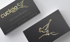
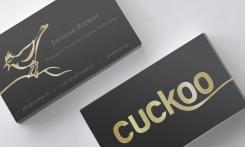
Toelichting van de designer mtzgr:
Here is a proposal of a business card playing with both sides of it. The Cuckoo logo allows creating an interesting link between the two sides of the card. In this way, it gives a hint that there is something connected on the back of the card. It makes it more appealing and avoids the classic organization of a business card.
“Cuckoo” stands strong on the front side and the bird is highlighted on the back side with all the information.
To make the card more elegant, the Cuckoo logo will be embossed and recovered of gold foil.
I remain at your disposal for further changes.
-
jbremer zegt :
Very nice design. Could you change the smaller text from italic to normal font? One could argue that the ".sh" part looks like ".sb" :)
-
Deze wedstrijd is gesloten. Commentaar geven is niet meer mogelijk.
-