New logo for sustainable and dismountable houses : NESTO
Wedstrijd gegevens:
Pakket zilver
- Wedstrijd van: Luxusbierger
- Categorie: Logo
- Totaal budget: € 329.00
- Datum start : 25-06-2016 15:31
- Datum einde : 09-07-2016 15:27
- Status : Beëindigd
- Benodigde formaten: jpg,ai
- Relevante bestanden: Geen
-
Beschikbare talen:

- Aantal inzendingen: 208
-
Respons opdrachtgever:
laag hoog
Behoefte:
We need a logo that does transport the vlaues of this housing project:
- SOCIAL: social cohesion, well being, family, frame of life- transgenerational
- HEALTH: nature, air and water quality, healthy buidling
- ENVIRONNEMENT: sustainable construction, deconstruction, builidng as a material bank, upcycling, building proving energy.
The name NESTO is choosen because is it similar to the word nest= habitat for animals, -> natural , safe, base of live,....
The word nest has no negatif meaning.
The O is a symbol for the closed world we are living on. but the O at the end is a symbol for perfection. In adition the symbol fo the infinity (∞) should be visble in order to illustrate that we do want to re-use the ressources used for the next building.
Bedrijfsomschrijving:
Doelgroep:
Kleuren, favoriete logo's, must haves
Huis van Maartje
-
-
Toelichting van de designer Huis van Maartje:
The logo of your preference, with the right pay-off this time
-
Deze wedstrijd is gesloten. Commentaar geven is niet meer mogelijk.
-
-
-
Toelichting van de designer Huis van Maartje:
Hi Jeannot;
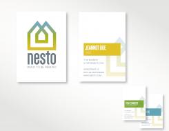
For the overall feeling of implementing the logo in a cooperate identity, here a concept design for a potential business card.
I also fine tuned the logo a bit from a capital font to a subscript, which makes the overall feeling a bit more gentle and comfortable.
Your feedback en preferences are welcome.
Best regasrds, Maartje -
lyra zegt
Hello Huis van Maartje, can you try to be honest and compete fairly, without attempting to influence the contest holder by misrepresenting and attacking the other [4-star-rated] designers without any argumentation.
1) None of my submitted designs follow the concept of your logo submission, neither were inspired by "your" [or any other] designer's concept. I followed the contest brief and based my logo on the CH wishes, Houses + infinity sign [integrated], which are common elements of graphic design.
However, your logo submission is very similar to these, already existing, logo designs [see the 2 existing logos here >
a) https://t4.ftcdn.net/jpg/00/92/69/07/240_F_92690724_KDJwioOyrS7PlTwmJ8AgMsUWL7nTr701.jpg ],
b) https://dribbble.com/shots/491175-Boligklubben
Why do you say then that you are the originator of that concept?
Applying your criteria, we can say now that you are actually the one who has "stolen" the other designer's concept. Aren't you?
2) If you can stand behind what you wrote at my contest page, why didn't you report my designs to Brandsupply?
3) As a designer, you supposed to be familiar with Concept Originality Policy and be aware of the fact that any concept presented in the brief can be developed by all designers. If the CH stated that he/she wanted the infinity symbol for his housing project [mentioning nature, air and water quality, healthy building...] you should understand that some similarity in shapes and colors are to be expected and that obvious concepts [with houses and infinity symbol] are open to be developed by all designers. And you can not claim any rights neither to the infinity-houses concept, nor the blue-green color-combination, use of gradient, rounded font....
4) On the other hand, offering extra items [business cards & letterhead] that were neither asked by the CH nor belong to the the logo contest category, IS against the code of conduct; and you are the only designer in this contest who offered it; only in that sense your submissions are unique in this contest...
Therefore, once again - just try to compete fairly, please.
Best regards,
Lyra
-
Deze wedstrijd is gesloten. Commentaar geven is niet meer mogelijk.
-
-
-
Toelichting van de designer Huis van Maartje:
The same concept in basics, but without the arrow pointing at the name. I personally thinks that it makes de logo even stronger this way. Good suggestion.
One with the old font and one with a new one which I, the longer I look at it, personally prefer ;-)
Your reaction is welcome.Thanks -
lyra zegt
Your logo submission is very similar to these, already existing, logo designs [see the 2 existing logos here >
a) https://t4.ftcdn.net/jpg/00/92/69/07/240_F_92690724_KDJwioOyrS7PlTwmJ8AgMsUWL7nTr701.jpg ],
b) https://dribbble.com/shots/491175-Boligklubben -
Deze wedstrijd is gesloten. Commentaar geven is niet meer mogelijk.
-
-
-
lyra zegt
However, your logo submission is very similar to these, already existing, logo designs [see the 2 existing logos here >
a) https://t4.ftcdn.net/jpg/00/92/69/07/240_F_92690724_KDJwioOyrS7PlTwmJ8AgMsUWL7nTr701.jpg ],
b) https://dribbble.com/shots/491175-Boligklubben -
Manuel Di Cam zegt
http://www.aislingverondesign.com/portfolio/maison-estate-agents/
-
Manuel Di Cam zegt
Hello, maybe you did not know about, but someone made a drawing before, and your design looks a bit like him. It happens to everyone, including God. Best Regards.
-
Deze wedstrijd is gesloten. Commentaar geven is niet meer mogelijk.
-
-
-
Toelichting van de designer Huis van Maartje:
different colourstyles
-
Huis van Maartje zegt
ofcourse the subtitle can be changed
-
Deze wedstrijd is gesloten. Commentaar geven is niet meer mogelijk.
-
-
-
Geen commentaar
-
Deze wedstrijd is gesloten. Commentaar geven is niet meer mogelijk.
-
-
-
Toelichting van de designer Huis van Maartje:
Just for the overall feeling
-
Deze wedstrijd is gesloten. Commentaar geven is niet meer mogelijk.
-
-
-
Toelichting van de designer Huis van Maartje:
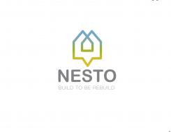
Here, the first concept. A clear design in a simple style which meets up the values of yout demand.
I alternate the infinity symbol to a house icon which symbolises the re-use of materials/buildings.
The color use radiates warmth (deep yellow=sun), nature (green=recycling, responsible), en air (blue=clean).
Ofcourse it is possible to make adjusments if you like for example in colour or font.
I hope this will meet up your expectations,
Sincerely
Maartje Janssen -
Luxusbierger zegt :
HI, txs for your proposal, it looks nice... just a question is there a reason for the downwards arrow ? could you try one without that?
Regards, Jeannot -
Deze wedstrijd is gesloten. Commentaar geven is niet meer mogelijk.
-

