Young intercultural company looking for it's logo
Wedstrijd gegevens:
Pakket zilver
Behoefte:
We are a young company that deals in intercultural consultancy. We need an elegant and simple logo hat expresses our aptitude within our network.
Bedrijfsomschrijving:
Our company has been founded in February 2015 and deals predominantly in anything that pertains to intercultural business, from consultancy to assistance and facilitaion. We provide tailor made solutions to businesses as well as private individuals in any sector where this may be required through our extensive network.
Doelgroep:
Our main target concerns businesses that do inter(national/cultural) business. predominantly in Europe our network extends worldwide. Furthermore, we are in the business of aiding expats, to immigrate and emigrate from A to B, wherever that may be, and assist them with any challenges they may encounter.
Our services comprehend but are not limited to (inter ntaional/cultural): Finance, Logistics, Legal, Recruitment and Selection, Property Management, Administration etc.
Kleuren, favoriete logo's, must haves
We are looking for a unique, simple and elegant logo that expresses our know how.
During a brainstorming session we have come up with the idea of a spider juxtaposed on the world, covered by it's web.
The symbolism behind it was the company as dominating the web, to emphasize our know-how.
The web would symbolize the nodes and contactpoints we provide and handle.
The world would stand for multiculturalism.
We had trouble relating this to what ultimately is more important : the elegant and simple prerequisite. Furthermore it is absolutely not desireable that the logo can be mixed up with something else (ie : spiders very easily related to spiderman)
We were personally thinking of 2 colors : silver/chrome and blue to emphasize our trustworthiness.
We have attached several googled pictures to give an idea of what may be incorporated in the above mentioned logo.
Then again, we are open to completely different suggestions, the most important thing to us is that it is a unique, simple and elegant logo that oozes professionalism.
Strajo
-
-
Toelichting van de designer Strajo:
Hi,
I have seen your feedback and made few changes... I hope that you will like it and feedback. -
M.Violin zegt :
Hey Strajo,
Thank you vry much this is very nice.
We are hopeful that you will send us a new design and think that the current iteration is as good as it will get.
Best,
M. -
Deze wedstrijd is gesloten. Commentaar geven is niet meer mogelijk.
-
-
-
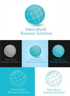
Toelichting van de designer Strajo:
Hi,
Thank you for your reply. I have made few changes in logo as you said and i also put a flat view of logo. i hope that you will loke it and feedback. -
M.Violin zegt :
Dear Strajo,
Thank you for the changes once again.
We think that the design looks great and we appreciate you sticking with our feedback.
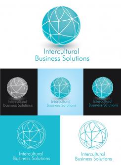
That being said, we were wondering if you could possibly rearrange the lines on the sphere, or turn the sphere 90+ degrees. It has been pointed out to us that the current design of the web/grid looks like something that is undesireable and it can not be unseen by some employees. The odds of a client seeing that are slim, but we wish to get rid of these odds completely. We hope you could take a look at that.
If there are any more questions, please contact us.
All the best,
N.
-
Deze wedstrijd is gesloten. Commentaar geven is niet meer mogelijk.
-
-
-
Toelichting van de designer Strajo:
Hi,
I have read you feedback and made changes, as you can see. I have put two logos onw with water, and another without. Also i have made a logo on t-shirt and business card. I hope that you will like it and feedback. :) -
M.Violin zegt :
Dear Strajo,
Thank you very much for your changes.
We like this a lot and we think that your design without water has the potential to be a winner :)
Having said that, there are two comments that arose while analyzing your submission.
First, even though you have done a great job reducing the "ring", the contrast is still there, is it possible to adjust that just a tiny bit more?
Furthermore when you expand the logo, you see that in the periphery the lines become mismatched, broken or do not connect. Would it be possible to adjust this?
Thanks again for your input and we are looking forward to see the final result !
Best,
M. -
Deze wedstrijd is gesloten. Commentaar geven is niet meer mogelijk.
-
-
-
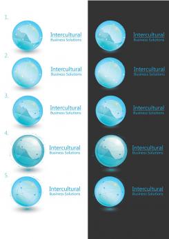
Toelichting van de designer Strajo:
Hi,
I have read your feedback, and i made few more logos. I couldn't deside which one to send you because there are so many variables, so i sent you few of them. I must say that the web is more prominent than you see on pictures. That is beacuse I use illustrator and when i compress into jpg. it loses that intensity, but it doesn't make so big differences. The sphere is lighter and in some logos there is no water... Web that represents the connection is set up around hole world. I hope that you will like it and feedback.
-
M.Violin zegt :
Hey Strajo,
Thank you for your new submission.
We apreciate the fact that compression distorts the look of your work and we will somewhat take this into consideration but we will judge the quality of work as we see it.
We found it useful that you would make multiple versions of your logo. We have found that we prefer the first two iterations. However they still have the "ring"at the inner periphery of the sphere could you dilute this effect? Would it be possile to make the sphere look like a transparent blue marble much like in your first submission?
Lastly, we are worried that if the Logo is printed as posted by your submission, the company name would become too small and unreadable. Could this be made bigger? Also we prefer a look where the typography of Intercultural Business Solutions is of the same size even if this means that the text is not exactly aligned. Lastly, could the company name be placed under the sphere as in your firs submission? we appreciate the fact that it could be hard to do given the long name but we are eager to have your spin on it.
Best,
M.
We do not mind if the network is a minute detail such as in your previous submission, that type of design got the most votes from us. -
Deze wedstrijd is gesloten. Commentaar geven is niet meer mogelijk.
-
-
-
Toelichting van de designer Strajo:
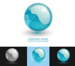
Hi, here is my idea of logo. I have read what you wanted to be like, but i think that the world map is to complicated so i didn't put it, also i didn't put the spider because i think it isn't necessary. I liked your idea with web so i put somethnig that reminds on web and connection with world. I hope that you will like it and feedback.
-
Strajo zegt
I forgot to say that i didn't put company name, because you didn't mentioned it. So i put some space for company name.
-
M.Violin zegt :
Hey Strajo,
Thank you very much for your submission!
Our company name is : Intercultural Business Solutions
I will see if I can edit the text written above to incorporate it.
We are happy that you went your own way with the design and like the colors and the little nodes as a detail in the sphere. I understand your point about the world map being complicated and do not fault you for leaving it out. However, the line's that show the separation earth/water as they appear now, seem a little off.
Since some steps have been taken from our initial idea anyway, we were inspired and wondering if we could venture a little further? What would you think of a "simple" sphere covered completely by the "web and connection" skin that you already used.
For the sphere, We like the color blue as you used for the letters in "Company Name" as well as the 3d rendering but we rely on you for a design that you think is best. However, we have our reserves as tho the darker blue circle within the perimeter of the sphere.
We want to thank you again for your input and are looking forward to see how you choose to use our feedback.
Please don't hesitate to let us know if you have any further questions and/or comments.
Best,
M. -
Deze wedstrijd is gesloten. Commentaar geven is niet meer mogelijk.
-


